Highlights
- New design replaces small square pictures with larger, more informative boxes.
- Trailers now play inside the enlarged boxes when hovered over.
- Simplified menu system with top row navigation: search, home, shows, movies, My Netflix.
- “My Netflix” feature offers personalized recommendations based on viewing history.
Netflix is making big changes to how its TV app looks.
They are testing a new design for the homepage, as per a report from The Verge.
Here’s what you should know about it
The new look is very different from the old one.
Instead of little square pictures for shows and films, there will be bigger boxes.
When you point at a box with your remote, it will get bigger to show you more information.
At the moment, when you hover over a title, a trailer plays at the top of the screen.
But with the new design, the trailer will play inside the bigger box itself.
You won’t need to look up to see it.

Customers were reportedly performing “eye gymnastics” looking around to different parts of the home screen in an attempt to find a show or movie to watch, so Netflix wanted to simplify the navigation experience. “We really wanted members to have an easier time figuring out if a title is right for them,” Netflix senior director of product Pat Flemming told The Verge.
Emma Roth, writing for The Verge: Netflix is testing a big homepage redesign on its TV app. The new look replaces the static tiles containing the shows and movies you want to watch with boxes that extend as soon as your remote lands on them.
That’s not the only thing Netflix is changing about its look. The refresh gets rid of the menu that pops out from the left side of Netflix’s homepage and replaces it with a more streamlined selection of options at the top of your screen: search, home, shows, movies, and My Netflix.
New UI Changes
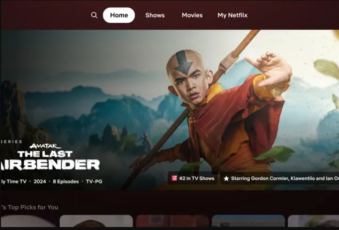
The bigger boxes will also show details like the year the show came out, how many episodes there are, and what type of programme it is.
All this information will be easy to see without having to read small writing.
Netflix boss Pat Flemming said the changes should make it easier to decide if you want to watch something.
He said people often have to move their eyes around a lot with the current design.
As well as the bigger boxes, Netflix is changing the menu system too.

Instead of the menu popping out from the side, there will be a row of simple options at the top: search, home, shows, movies and My Netflix.
That’s a pretty streamlined approach from earlier on where the interface was pretty cluttered.
The My Netflix part is new and will suggest programmes for you based on what you’ve watched before.
Some of the old menu options like Categories are being removed to make it simpler and should makes titles easier to find.
Flemming said this is just their first try at improving the TV app experience.
He hopes it will work well and then they can make it available to most Netflix members in the coming months.
FAQs
What are the main changes in Netflix’s new telly app design?
Netflix is testing a new design that replaces small square pictures with larger boxes that show more information when hovered over.
Trailers will play within these boxes instead of at the top of the screen.
How will the new design help users decide what to watch?
The bigger boxes will display details like the release year, number of episodes, and program type, making it easier to gather information without reading small text.
What changes are being made to the menu system?
The menu will no longer pop out from the side. Instead, there will be a simple top row of options: search, home, shows, movies, and My Netflix.
What is the new “My Netflix” feature?
“My Netflix” will provide personalized recommendations based on what users have watched before, helping them find new content more easily.
Are any menu options being removed in the new design?
Yes, some old menu options like Categories are being removed to simplify the interface and make titles easier to find.
Also Read: Netflix Implements Password Sharing Restrictions in India: Learn About the New Rules, and More